
Big projects take teamwork—and collaboration is much easier when everyone can see the plan. A Gantt chart gives your team a clear picture of what’s happening, when it’s happening, and what work is coming next.
There are 3 ways to get a Google Sheets Gantt chart, depending on how you want to work:
- Build one from scratch using the step-by-step tutorial below
- Use a free template and plug in your tasks
- Use dedicated Gantt chart software if you want a timeline that updates automatically as plans change
If you’ve never built a Gantt chart before, you’re in the right place. Google Sheets is familiar, easy to share, and flexible enough for basic project scheduling.
The tradeoff? Like Excel Gantt charts, a Google Sheets Gantt chart takes manual setup—and it won’t automatically adjust everything for you when dates change.
By the end, you’ll know how to create a clean, professional-looking Gantt chart in Google Sheets—and have a free template to save time on your next project.
Want to skip the manual setup entirely? Try TeamGantt’s free AI Gantt Chart Maker to generate an instant project timeline with a simple prompt.
Understanding Google Sheets Gantt charts
Google Sheets is a practical place to start with Gantt charts.
A Google Sheets Gantt chart puts your project plan on a timeline so you can see how the work plays out—and keep everyone working from the same schedule. Each task becomes a horizontal bar, so you can quickly tell what’s coming up and what’s happening at the same time.
How a Google Sheets Gantt chart works
A stacked bar chart is the backbone of a Google Sheets Gantt chart.
In Google Sheets, you’ll usually build a Gantt chart with a stacked bar chart based on your task table. Each bar represents one task and shows:
- Start date: When the task begins
- End date: When the task finishes
- Duration: How long the task takes
Benefits of Google Sheets Gantt charts
Google Sheets makes it easy to keep everyone on the same schedule.
Google Sheets is a good fit when your plan is fairly simple and you need to share it with other people. It’s easy to keep one version of the schedule that everyone can view or update.
- Easy to share: Give teammates view or edit access.
- Work together in real time: Multiple people can review and update the plan.
- Familiar format: If you’re comfortable with spreadsheets, the learning curve is low.
- Flexible structure: You control your columns, labels, and layout.
Limitations of Google Sheets Gantt charts
Google Sheets Gantt charts work—but they take upkeep.
Google Sheets can get the job done, but it’s still a spreadsheet. That means you’ll spend time setting things up, and you’ll need to keep it updated as dates move around.
- Manual setup: You’ll build the table, formulas, and chart formatting yourself.
- Manual updates: Date changes mean updating the sheet (and sometimes the chart range or formatting).
- Limited automation: Dependencies don’t automatically shift tasks for you.
- Harder to manage at scale: Big plans can get messy fast.
Alternative: Use Google Sheets Timeline view (built-in)
Timeline view is Google Sheets’ built-in way to visualize tasks over time. It turns your sheet data into an interactive timeline without needing to build a stacked bar chart.
If you have access to Timeline view, it can be a quick way to see start and end dates in a timeline format—especially for lightweight planning.
When Timeline view is a good fit
- You want a simple timeline with minimal setup.
- Your team already works in Google Sheets and you mainly need visibility.
When to use the stacked-bar Gantt method instead
- You want more control over formatting and how the chart looks.
- You need an approach that works reliably across accounts (including when Timeline view isn’t available).
Timeline view is a fast option when it’s available. For a fully customizable Google Sheets Gantt chart you can reuse on any project, build it with a stacked bar chart using the steps below.
1. Set up your Google Sheets data
Your Google Sheets Gantt chart is only as clean as the data behind it.
Before you build anything, you’ll organize your task list and add the helper columns the timeline needs. This is the foundation your Gantt chart will be built on.
Step 1: Structure your project table
Open a new Google Sheet and create a table with these columns. Think of this table as your source of truth. Your Gantt chart will pull directly from it.
Project data columns (required)
These are the dates and task names you’ll plan from.
- Task name: Clear, specific descriptions of each task
- Start date: When each task begins (format as a date)
- End date: When the task finishes (format as a date)

Step 2: Calculate your helper columns
Now you’ll add the numeric fields that make your stacked bar chart work like a Gantt chart.
Add 2 new helper columns to your table: Start on Day and Duration.
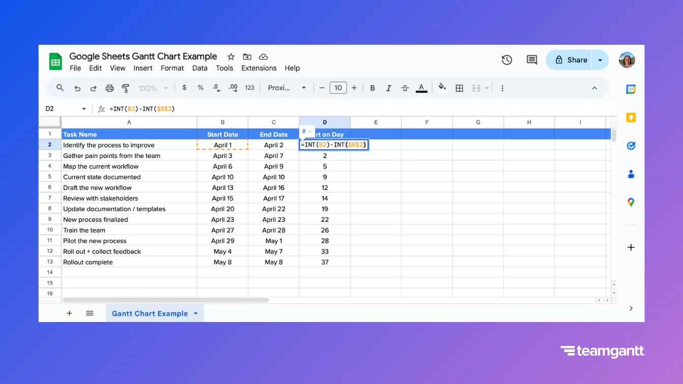
Helper column 1: Start on Day
Start on Day is the number of days between your project start date and each task’s start date. For example, a task that starts on day one shows 0; a task that starts a week later shows 7. This value acts as the “offset” that pushes each task bar to the right starting point.
Start on Day formula = Task Start Date − Project Start Date
- In the first Start on Day cell next to your first task, enter: =INT(B2)-INT($B$2)
- Press Enter.
- Fill the formula down the column.
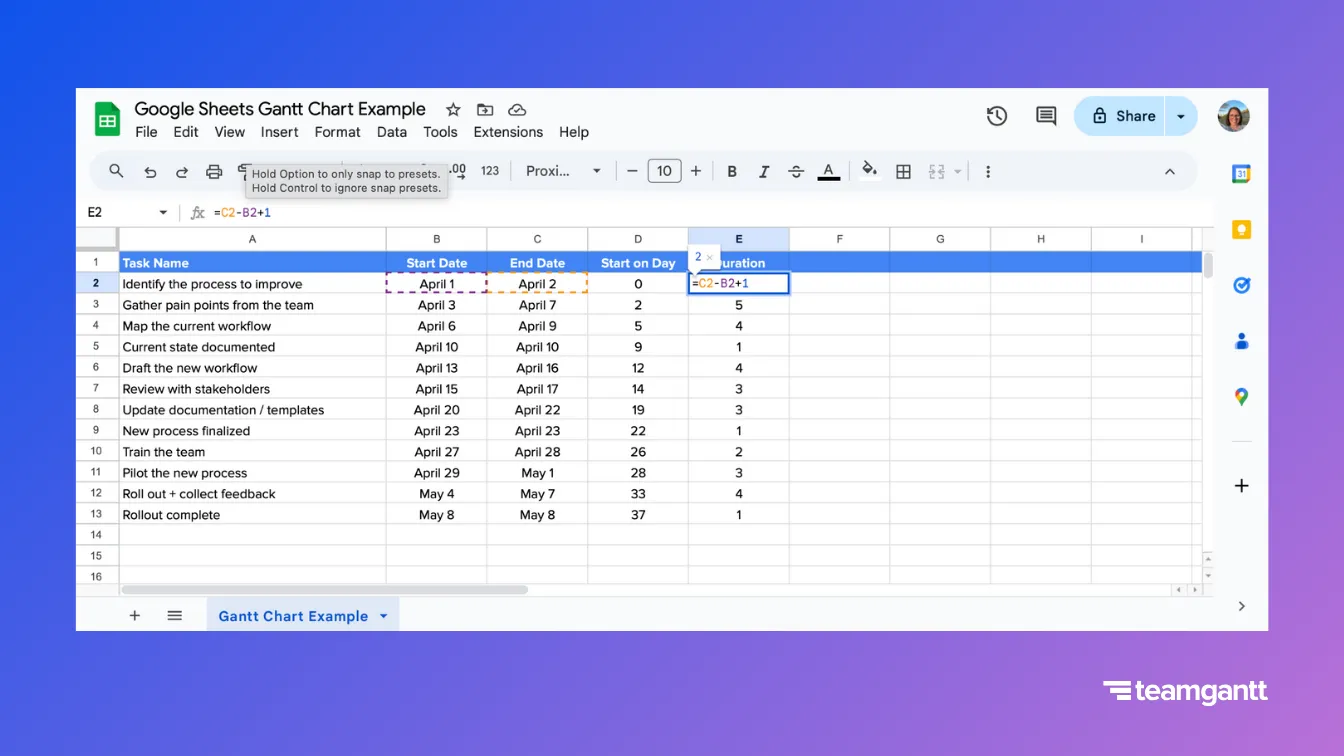
Helper column 2: Duration
The Duration column determines the visible length of each task bar. A simple formula automates this calculation and helps make your stacked bar chart work like a Gantt chart.
Duration formula = End date – Start date + 1
- In the first Duration cell next to your first task, enter: =C2-B2+1
- Press Enter.
- Fill the formula down the column.
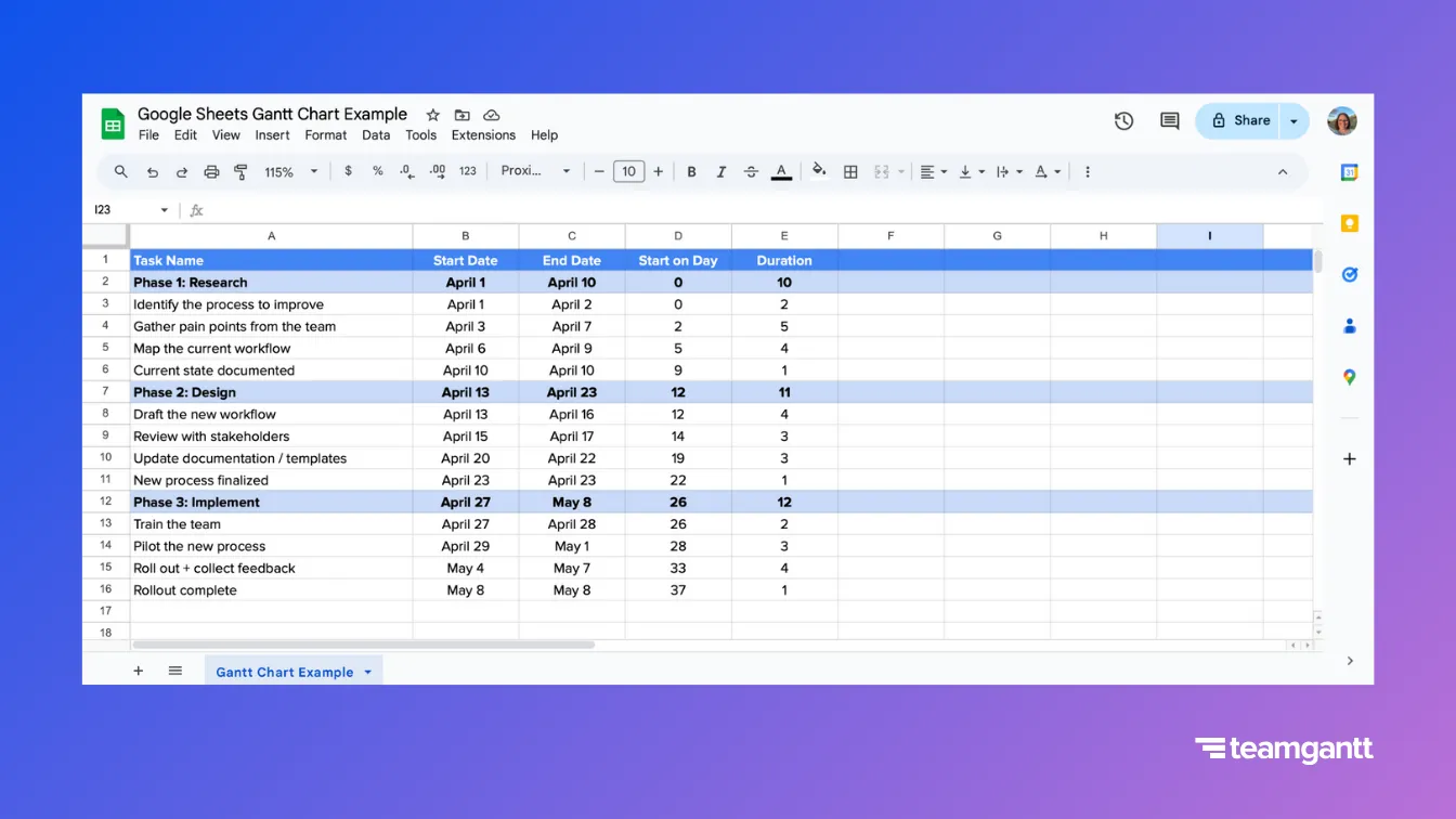
Step 3: Organize tasks into project phases (optional)
Phase rows make the timeline easier to scan and understand—especially for large projects with lots of tasks.
- Insert a row before the first task in each phase.
- Enter the phase name in the Task Name column.
- For the phase’s Start Date, use the earliest start among its tasks.
- For the phase’s End Date, use the latest finish among its tasks.
Step 4: Add tracking columns (optional)
Add these if you want to manage the project from the same sheet—not just display the timeline.
- Assigned to: Who owns the task
- Status: Not started / In progress / Done (or your preferred labels)
- % Complete: A number from 0–100 to track progress
- Notes: Links, project requirements, or anything your team needs to know
- Predecessor (manual): The task that must finish before this one can start
2. Build your Google Sheets Gantt chart
Now that your data is set up, it’s time to turn it into a visual timeline. This first chart won’t look perfect yet—and that’s okay. You’re just giving Google Sheets the building blocks so you can shape them into a Gantt chart.
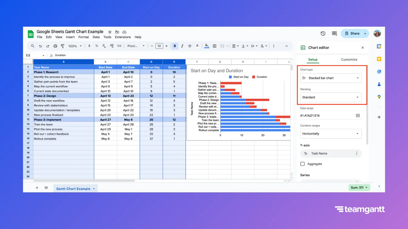
Step 1: Insert a stacked bar chart
- Select the Task Name, Start on Day, and Duration columns (including headers).
- Click Insert → Chart.
- In the Chart editor, choose the Stacked bar chart and make sure Stacking is set to Standard.
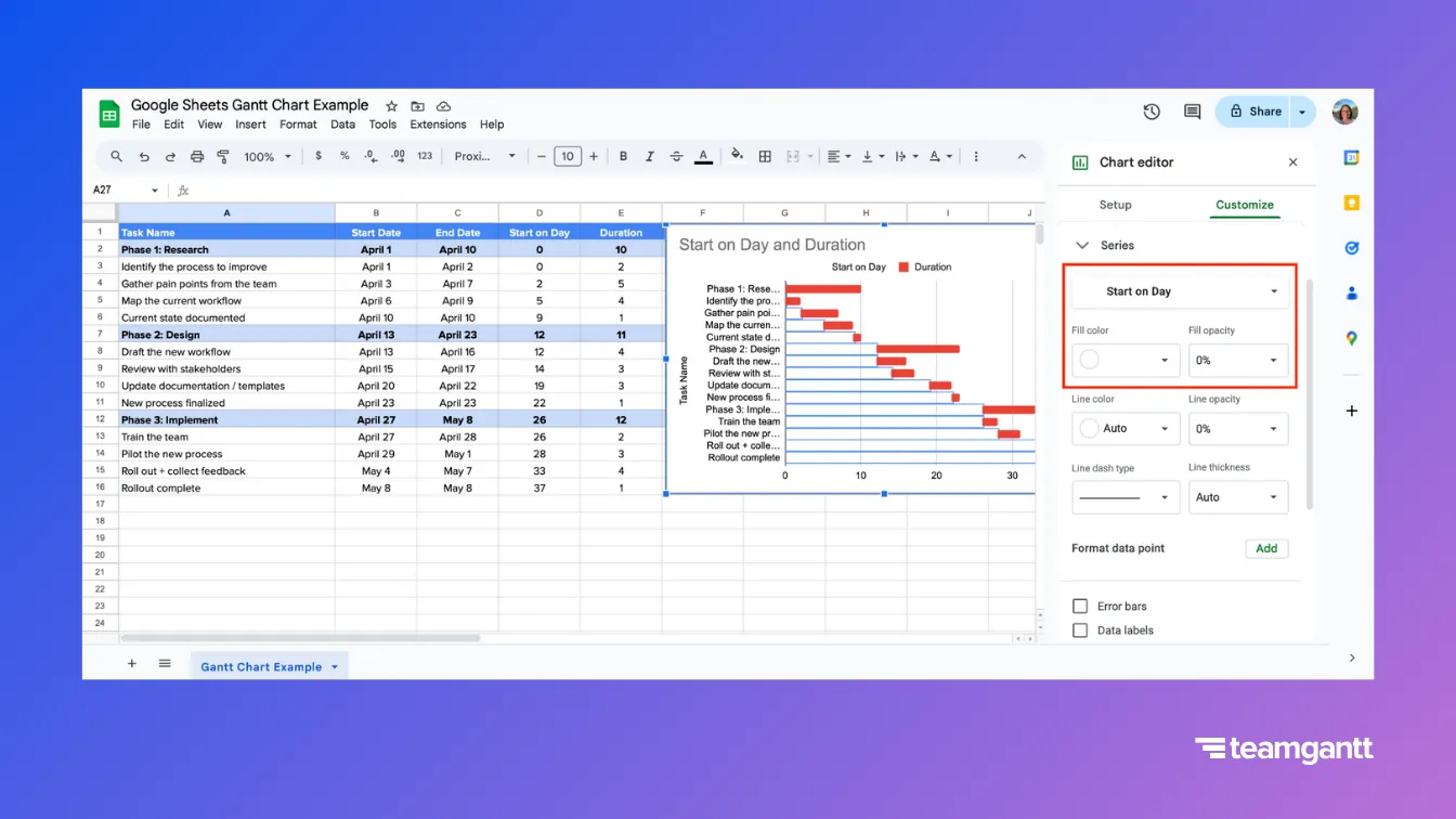
Step 2: Hide the “Start on Day” bars
This step is the key move that turns a stacked bar chart into a Gantt chart. The Start on Day series becomes an invisible spacer so your task bars start in the right place.
- Click the Start on Day portion of any bar to select that whole series.
- In the Chart editor, go to Customize → Series.
- Choose No fill under Fill color—or 0% under Fill opacity—to remove that first segment.
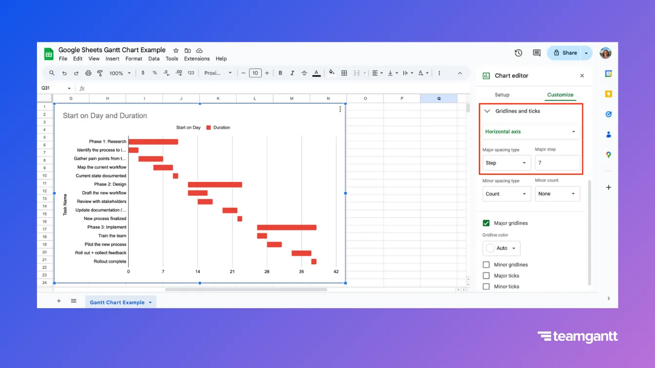
Step 3: Set your timeline intervals (weekly or monthly)
Your interval setting controls how “zoomed in” your timeline feels.
- Go to Customize → Gridlines and ticks.
- Under Apply to, choose Horizontal axis.
- For a weekly view, set Major step to 7.
- For a monthly view, set Major step to 30. (Since months vary in length, this will be a close approximation).
At this point, you have a working Google Sheets Gantt chart. Next, we’ll format it so it’s easier to read, share, and present.
3. Format and customize your gantt chart
Once you’ve built the basic chart, formatting makes all the difference. This step is about turning a rough bar chart into a clear, presentation-ready timeline your team can actually use. Not every project will need every option, so feel free to pick and choose.
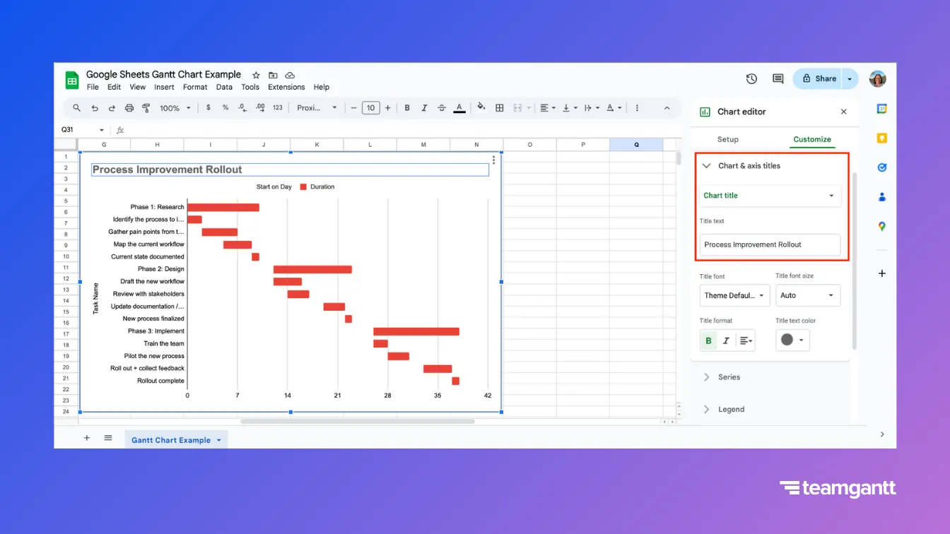
Add a custom chart title
Giving your chart a project-specific title adds instant clarity—especially if your team has multiple timelines floating around.
Double-click the chart title and type your project name.
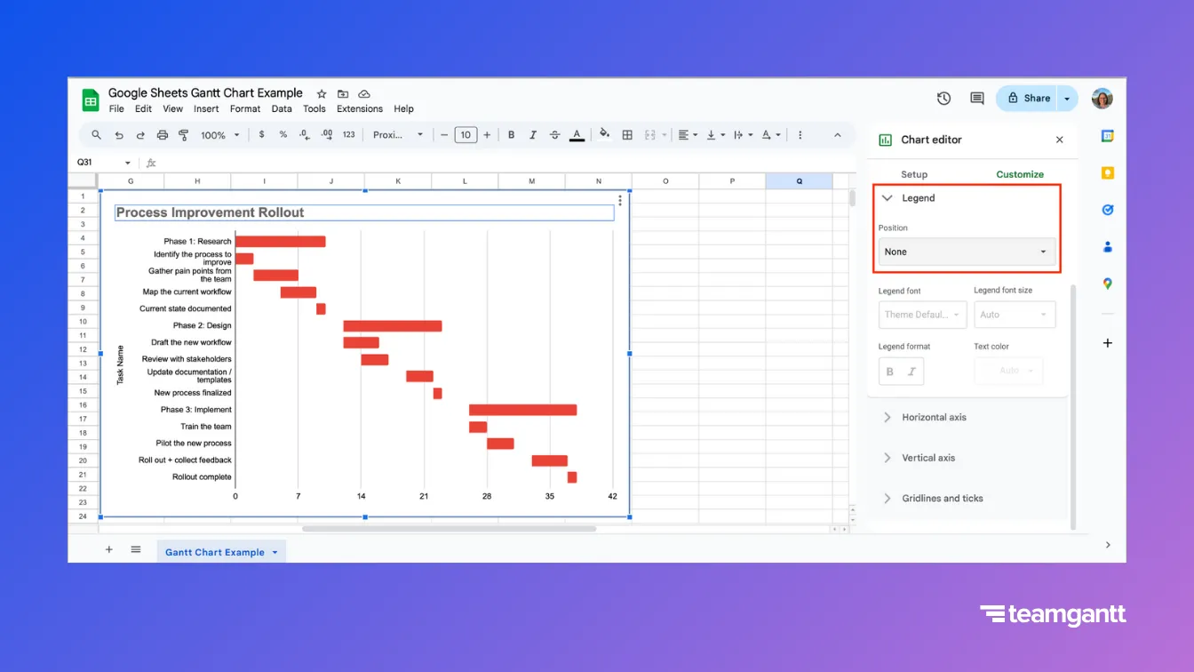
Remove the legend (optional)
After you hide Start on Day, the legend usually isn’t telling you anything new. Removing it gives you more space for the timeline itself.
- In the Chart editor, go to Customize → Legend.
- Set Position to None.
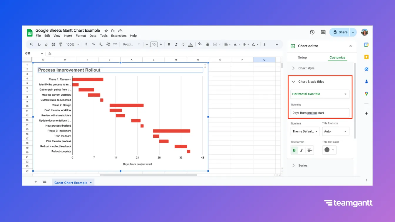
Clean up your axis titles (optional)
Gantt charts should read like a schedule at a glance. Clearing the vertical axis title reduces clutter, and labeling the horizontal axis helps people understand what the numbers represent.
- Go to Customize → Chart & axis titles.
- Select Vertical axis title and clear it.
- Select Horizontal axis title and enter: Days from project start.
Color-code tasks
Color is one of the fastest ways to make a Gantt chart easier to scan in a meeting. You can use it to group work by phase, highlight high-priority items, or make milestones stand out—without forcing people to read every task name.
- Click a taskbar once to select the series, then click again to select a single bar.
- Choose a new Fill color in the settings.
- Repeat for other tasks as needed.
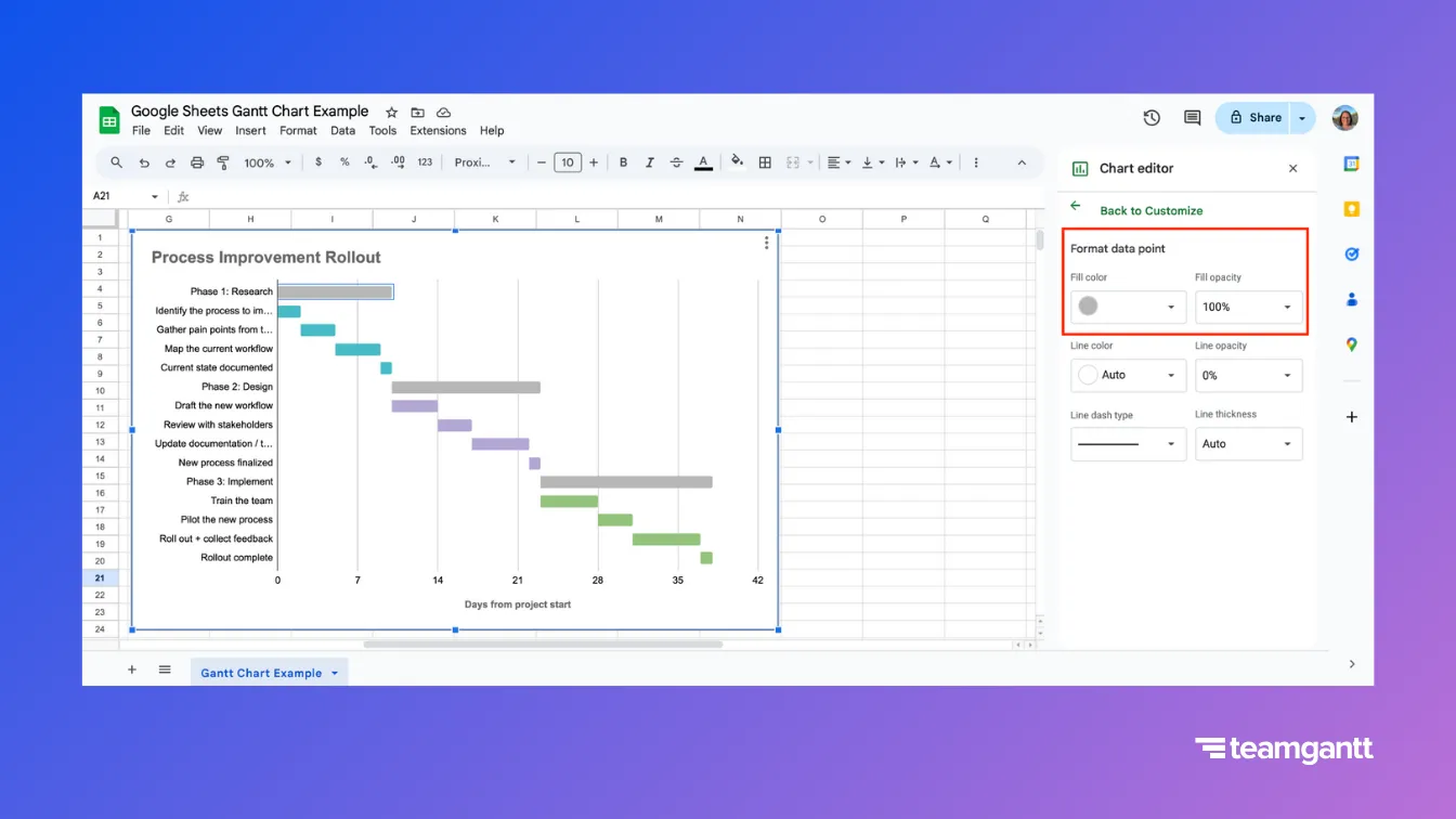
Format phase bars (optional)
If you added phase rows, those rows show up on the Gantt chart as their own bars. Color phase bars gray so they read like group headers—not individual tasks.
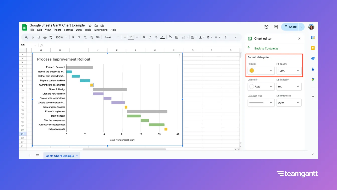
4. Add milestones to your project
Milestones highlight key moments in your schedule—like approvals, handoffs, launches, or deadlines. In Google Sheets, a milestone is easiest to manage when it behaves like a normal task row.
- Add a new row where the milestone belongs in your task list.
- In the Task Name column, enter the milestone name.
- Set the Start date and End date to the same date.
- Your Duration formula will display it as 1 day.
- In the chart, click the milestone bar once (select the series), then click again (select just that bar).
- Change the Fill color to yellow or gold so it stands out from other tasks.
5. Share, present, and collaborate
A Google Sheets Gantt chart works best when your team treats it as a shared source of truth—one place to review the schedule, discuss changes, and keep updates moving.
Here’s how to share your chart, present it in Google Slides, and collaborate smoothly on the work.
Share your Gantt chart with your team
Sharing is straightforward in Google Sheets. Just be intentional about setting permissions for who can edit, who can comment, and who should only view the chart.
- Click the blue Share button in the top right corner of your sheet.
- Enter the names and/or email addresses of the people you want to share it with.
- Use the drop-down (pencil icon) to choose their access level.
- Add a brief note, then click Send.
Present your Gantt chart to stakeholders
If you share updates in a slide deck, a linked chart lets you keep your timeline current without re-screenshotting it every time. When your Gantt chart changes in Google Sheets, you can refresh the visual in Google Slides so your status report stays up to date.
To import your Google Sheets Gantt chart into Google Slides:
- In Google Slides, go to Insert → Chart → From Sheets.
- Choose your spreadsheet, then click Select.
- Select the chart you want to import, and choose whether you want it linked to the spreadsheet.
- Click Import.
If you link the chart, you’ll be able to update it from Slides when your sheet changes (instead of pasting new screenshots every time).
Collaborate without creating version chaos
Google Sheets is great for collaboration. But schedules can get messy fast when multiple people are changing dates or working from their own copies.
A few simple ground rules help your Google Sheets Gantt chart stay reliable as the project moves.
- Keep one source of truth. Share one sheet instead of emailing copies around.
- Limit schedule edits. Give edit access to the people who maintain dates; everyone else can comment or view.
- Use comments for questions. Ask in comments instead of editing task dates directly.
- Use Version history when needed. Go to File → Version history to review changes and roll back if needed.
- Make ownership visible. An Assigned to column makes follow-ups faster.
Troubleshooting common Google Sheets issues
Even if you follow the steps exactly, Google Sheets can throw you a few curveballs. Here are the most common problems—and quick fixes—so you can keep moving.
Your chart still looks like a stacked bar chart (not a Gantt)
Problem
You can see two visible bar segments for each task (a “lead-in” bar plus the task bar).
Why it happens
The Start on Day series is still visible. It’s supposed to act like an invisible spacer that pushes each task bar into position.
Fix
Make the Start on Day series invisible.
- Click a Start on Day bar segment to select the series.
- In Chart editor, go to Customize → Series.
- Set Fill color to No fill.
- If No fill isn’t available, set Fill opacity to 0%.
Your formulas aren’t applying to the whole column
Problem
You entered the formula once, but the rest of the column didn’t fill in.
Why it happens
Google Sheets doesn’t always auto-fill formulas unless you confirm the suggestion or extend the formula range yourself.
Fix
- If Google Sheets prompts you to autofill, click the green checkmark to apply the formula down the column.
- If you don’t see the prompt, drag the fill handle (the small square in the bottom-right corner of the cell) down the column.
Your weekly timeline shows the wrong spacing
Problem
The timeline is grouped in a weird interval and doesn’t scan like a weekly schedule.
Why it happens
The chart’s Major step controls the spacing on the horizontal axis. If it isn’t set to 7, the timeline won’t read like weeks.
Fix
- In Chart editor, go to Customize → Gridlines and ticks.
- Under Apply to, choose Horizontal axis.
- Set Major step to 7 for weekly intervals.
Your horizontal axis shows weird dates
Problem
The timeline shows dates that don’t match your project (or you’re seeing unexpected old/future dates).
Why it happens
Your chart is using Start on Day, which is a day-offset number. If you format that axis as a date, Google Sheets will convert those numbers into calendar dates that don’t reflect your schedule.
Fix
- In Chart editor, go to Customize → Horizontal axis.
- Set the Number format to a plain number (not a date).
- (Optional) Add a horizontal axis title like Days from project start so it’s clear what the numbers mean.
Download a free Google Sheets Gantt chart template
Building a Google Sheets Gantt chart from scratch takes a lot of setup—especially if you need to repeat it for every new project. Our free Google Sheets Gantt chart template skips the busywork, so you can plug in tasks and get a working timeline faster.
How to use the Google Sheets Gantt chart template
To edit the template, you’ll need to save your own version in Google Drive:
- Open the template link.
- Click File → Make a copy.
- Name the copy, then save it to your Google Drive.
Choose a template layout
The template includes 3 options on tabs at the bottom of the sheet. Pick the one that matches how you want to work:
- Gantt Chart with % Complete: Includes built-in progress tracking.
- Basic Gantt Chart: A simpler version with fewer tracking fields.
- Manual Chart: More control if you want to customize the setup.
Update progress
If you’re using the Gantt Chart with % Complete tab, you can track progress directly in the sheet.
- Update the Percent Complete column from 0% to 100%.
- As the percentage increases, the progress bars fill in visually so it’s easy to scan what’s done—and what’s still in motion.
Change progress colors
If you want the progress colors to match your brand, you can update the conditional formatting used for % Complete.
- Click any cell in the Percent Complete column.
- Go to Format → Conditional formatting.
- In the rules panel, open Color scale.
- Change the Maxpoint color (100% complete) to your preferred color.
- Click Done.
Optional: Update chart colors (if needed)
If you’re also changing the colors inside the chart itself, you can do that in Chart editor → Customize → Series.
Google Sheets vs. Excel vs. Gantt chart software
Google Sheets, Microsoft Excel, and dedicated Gantt chart tools can all get you to a project timeline—but they handle collaboration and schedule changes very differently. The real question is how your team plans and how often your schedule moves.
How to choose the right tool for your Gantt chart
- Google Sheets: Best when you want one shareable file for a straightforward project—and you’re okay doing some manual upkeep as dates change.
- Microsoft Excel: Best when your workflow is spreadsheet-first and you’re building timelines mainly for planning or reporting (often solo, or with limited collaboration).
- Gantt chart software: Best when schedules change often, task order matters, or multiple people need to coordinate work in one living schedule.
When it’s time to upgrade from Google Sheets
Google Sheets is a solid starting point, but it starts to break down when the schedule needs to move fast and stay connected.
It’s usually time to upgrade when:
- Dates change often and updating your sheet feels like constant maintenance.
- Dependencies matter and you need tasks to shift automatically when something slips.
- Multiple people are editing schedules, and you want clearer ownership and fewer accidental changes.
- You need to forecast workload/capacity before committing to dates.
If those pain points sound familiar, collaborative Gantt chart software can save you hours of manual upkeep and reduce schedule confusion.
Best practices for Google Sheets Gantt charts
A Google Sheets Gantt chart is only helpful if it stays easy to update. These best practices keep your timeline readable, reduce maintenance, and prevent small spreadsheet changes from turning into big schedule confusion.
- Keep the chart range tight. Chart only what you need (Task Name, Start on Day, Duration) so the timeline stays readable.
- Treat “Start on Day” as a spacer, not a task. Hide that series so the visible bars “start” in the right place.
- Use inclusive duration day counting. =End-Date – Start-Date + 1 counts both start and end dates as full days.
- Pick one timeline zoom. Weekly charts scan best with Major step = 7. Monthly is typically Major step = 30 (approx).
- Make phases visual (not just organizational). If you want phase bars that span the work, use phase rows (and color them gray) rather than only a Phase column.
- Use milestones as 1-day bars. Set Start and End to the same date, then color milestones yellow or gold to stand out.
- Standardize how people update the schedule. Give edit access to date owners; everyone else reviews and comments.
- Let Google Sheets autofill formulas when it offers. Use the autofill checkmark to apply formulas down the column.
- Archive completed tasks to keep the chart clean. A smaller chart is easier to maintain and easier to present. Move completed task rows to an Archive tab (or below the active range) so your chart only plots what’s current.
- When in doubt, start from the template. Make a copy first, then replace placeholders with your tasks.
The goal is a timeline your team can trust—not a spreadsheet you have to babysit.
Conclusion: Choose your path to project success
Creating a Gantt chart in Google Sheets gives you a shareable project timeline in a tool most teams already use. In this guide, you’ve learned how to:
- Set up your project data
- Build and format a working Google Sheets Gantt chart
- Share and collaborate on one schedule in Google Sheets
For smaller or straightforward projects, Google Sheets can be a practical solution—especially when you want everyone aligned on the same plan. The skills you’ve picked up here will help you build timelines your team can follow and keep updated.
But if you’d rather save time and avoid spreadsheet upkeep, TeamGantt can do the heavy lifting for you. TeamGantt’s AI Gantt Chart Maker creates a project task list you can import into TeamGantt to generate a Gantt chart you can adjust right away.
Ready to get started?
- Option 1: Download the free Google Sheets Gantt chart template to skip setup and start planning faster.
- Option 2: Try TeamGantt’s AI Gantt Chart Maker to generate a task list and turn it into a real Gantt chart in minutes.
Whichever path you choose, you’re taking a smart step toward clearer plans and smoother project delivery.
Google Sheets Gantt chart FAQs
Does Google Sheets have a built-in Gantt chart tool?
Not exactly. Google Sheets doesn’t include a dedicated Gantt chart feature, but you can create a Gantt-style timeline using a stacked bar chart. Some Google Workspace accounts also include Timeline view as a built-in alternative for visualizing tasks over time.
Can you make a Gantt chart in Google Sheets?
Yes. Most DIY Google Sheets Gantt charts use a stacked bar chart plus two helper columns—Start on Day and Duration—to position task bars on a timeline.
How do I make a Gantt chart in Google Sheets?
At a high level, you’ll:
- Create columns for Task Name, Start Date, End Date, plus helper columns (Start on Day, Duration).
- Use a Start on Day formula like =INT(StartDateCell)-INT($FirstStartDateCell) (example: =INT(B2)-INT($B$2)).
- Use an inclusive Duration formula like =EndDateCell-StartDateCell+1 (example: =C2-B2+1), then fill down.
- Insert a stacked bar chart.
- Hide the Start on Day series so task bars start at the correct point on the timeline.
Is there a Gantt chart template in Google Sheets?
Google Sheets doesn’t include a true Gantt chart template by default. A common workaround is to start from a prebuilt Google Sheets Gantt chart template you can copy and reuse.
How do I make a Gantt chart template in Google Sheets?
Google Sheets doesn’t have a “Save as template” option for this use case. The simplest approach is:
- Open the Gantt chart sheet you want to reuse.
- Click File → Make a copy and name it something like “Gantt Template.”
- Store it in a shared Templates folder so teammates can make their own copy.
How do I format a weekly Google Sheets Gantt chart?
In Chart editor, go to Customize → Gridlines and ticks, set Apply to: Horizontal axis, and set Major step = 7.
How do I format a monthly Google Sheets Gantt chart?
In Chart editor, go to Customize → Gridlines and ticks, set Apply to: Horizontal axis, and set Major step = 30 (an approximation since months vary in length).
How can I automate a Gantt chart in Google Sheets?
A Google Sheets Gantt chart “automates” through formulas. If you use a template, the helper formulas are already set up—so changing dates updates the bars. If you build from scratch, helper columns like Start on Day and Duration power the chart, and the timeline updates whenever you change a date.
How do I track work progress in a Google Sheets Gantt chart?
Add a Percent Complete column (0–100%) and update it as work moves forward. You can also use conditional formatting (like color scales or data bars) to make progress easier to scan.
How do I add milestones to a Google Sheets Gantt chart?
Treat a milestone as a 1-day task: set Start Date and End Date to the same date, then format the milestone bar with a standout color (often yellow or gold).
How do I share or present a Google Sheets Gantt chart?
To share it, use the Share button in Google Sheets and set view/comment/edit access. To present it, insert it into Google Slides via Insert → Chart → From Sheets, then choose your spreadsheet and chart.