Which Task Color Should You Use to Be More Productive?

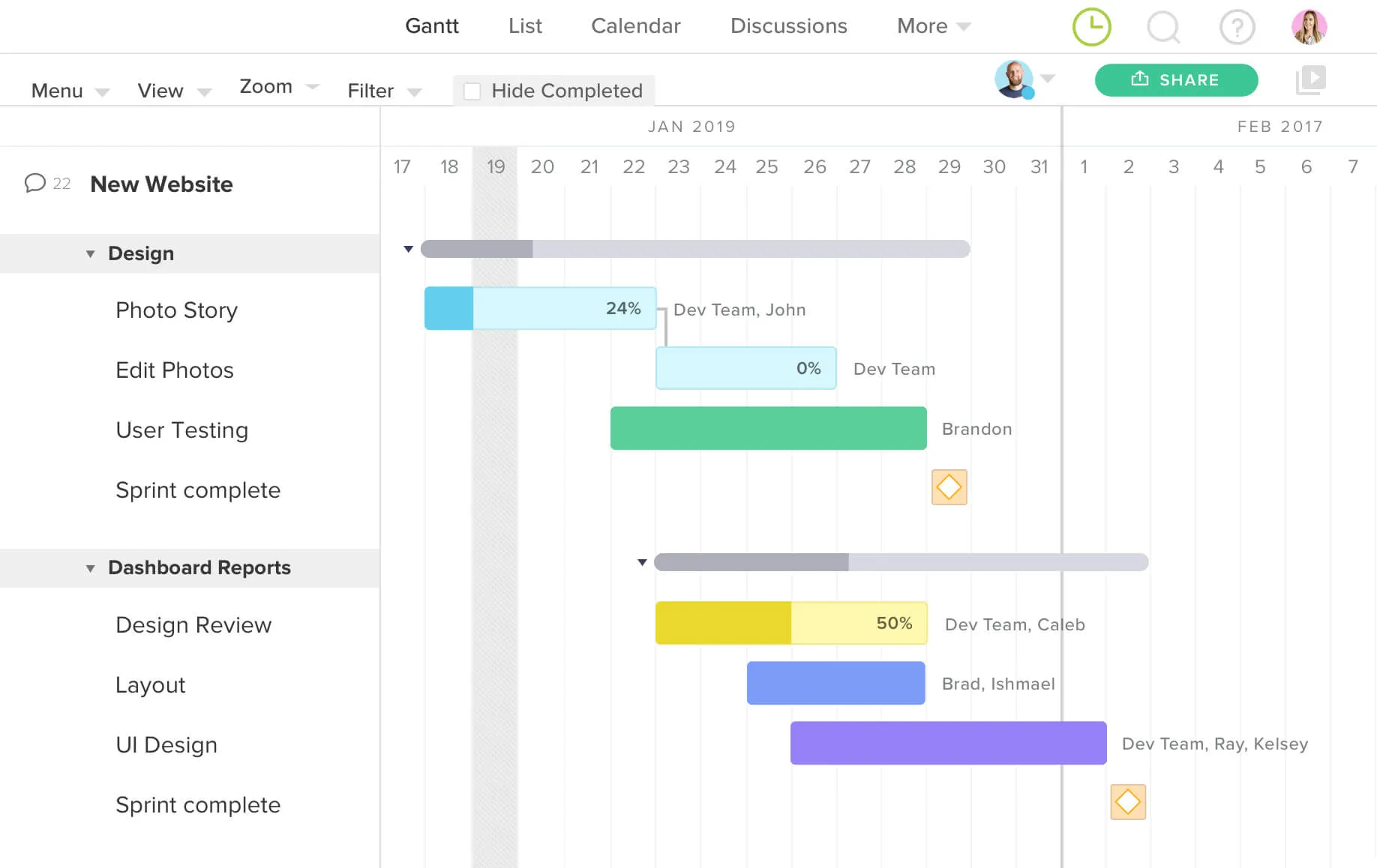
Colors are used to differentiate one task from another. That could be priority levels, who’s assigned, or even phases within a project. I wanted to take a look at the data in TeamGantt and see if the task color plays any role into task progression and completion.
My findings were interesting and, I must say, quite unexpected.
Which color is used the most?
"Basic Blue" is the default task color, and so it’s no surprise that it makes up roughly 60% of all tasks created.
In comparison, seven colors (almost half) are each used less than 1% of the time.
They say 1 is the loneliest number, so does that make these the loneliest colors:
- "Beneficial Brown"
- "Magnifying Magenta"
- "Prolific Purple"
- "Gainful Green"
- "Outstanding Orange"
- "Blissful Blue", and finally
- "Pretty Pink"?
Probably not since they have company.
Which color makes you more productive?
While it’s interesting to see which colors get used the most, it’s even more interesting to see the productivity and efficiency levels influenced by each color.
This is by no means a scientific look into how a task color affects productivity, but with millions upon millions of tasks having been scheduled and colored in Teamgantt, there may be a point to this data.
"Rosy Red", a color commonly used to mark important tasks, comes in third place as far as usage is concerned. What's interesting is that it's the color with the lowest average percent complete.
What does this mean? It means that it is the least likely to get progress updates of ALL colors.
Taking that a step further, 78% of tasks colored "Rosy Red" go completely ignored, not even getting a single progress update. It’s odd to see that a color so commonly used to specify important tasks is so likely to be ignored.

On the flip side "Pretty Pink", a task color that is only used only 0.9% of the time, commands the highest average percent complete, more than double that of "Rosy Red".
Continuing the trend of being the opposite of "Rosy Red", it is the color that is least likely to be ignored. Tasks colored "Pretty Pink" are most likely to have progress updates and be marked 100% complete, making it the most productive color.
A few other highly productive colors are:
- "Prolific Purple"
- "Gainful Green"
- "Great Green"
On the flip side, "Operation Orange", "Productive Purple", and "Golfer's Green" are among the least productive task colors alongside "Rosy Red". Maybe we should change the name of “Productive Purple”?
It’s interesting to see how both shades of purple and two of the three shades of green are both under- and over-performing the average.
Let’s dig into that a little deeper.
The over-performing colors tend to have a higher contrast between the color of the task bar and it’s progress bar. It could be that the contrast helps the task stick out more, thus being updated more often.
Could switching task colors make my team more productive?
At this point, you’re probably thinking, "What does this mean for me and my projects?"
Probably nothing, but why not try it out for your current or next project?
Try changing up the colors you typically use to more of the higher performing colors and see if it enhances productivity on your end. For instance, the quickest and simplest is to change all of your "Rosy Red" tasks to "Pretty Pink."
Lay a clear path to success with a visual plan that’s easy to understand, and keep everyone in sync with flexible workflows and team collaboration.


